
Purpose Bureau is a business-to-business ESG data company headquartered in Sydney, working across global entities, data sources, and international supply chains. It does not sell ESG consulting. It positions itself as an independent data bureau: it collects and structures verified information about companies, suppliers, emissions, and risk, then makes it usable for reporting and audit.
The buyers are corporate teams, not individuals. Sustainability leads, procurement and supply chain departments, finance, risk and compliance functions, climate and corporate reporting executives, plus the auditors and consultants who advise them. The company’s own site references work with financial institutions, industry bodies, and ASX-listed businesses.
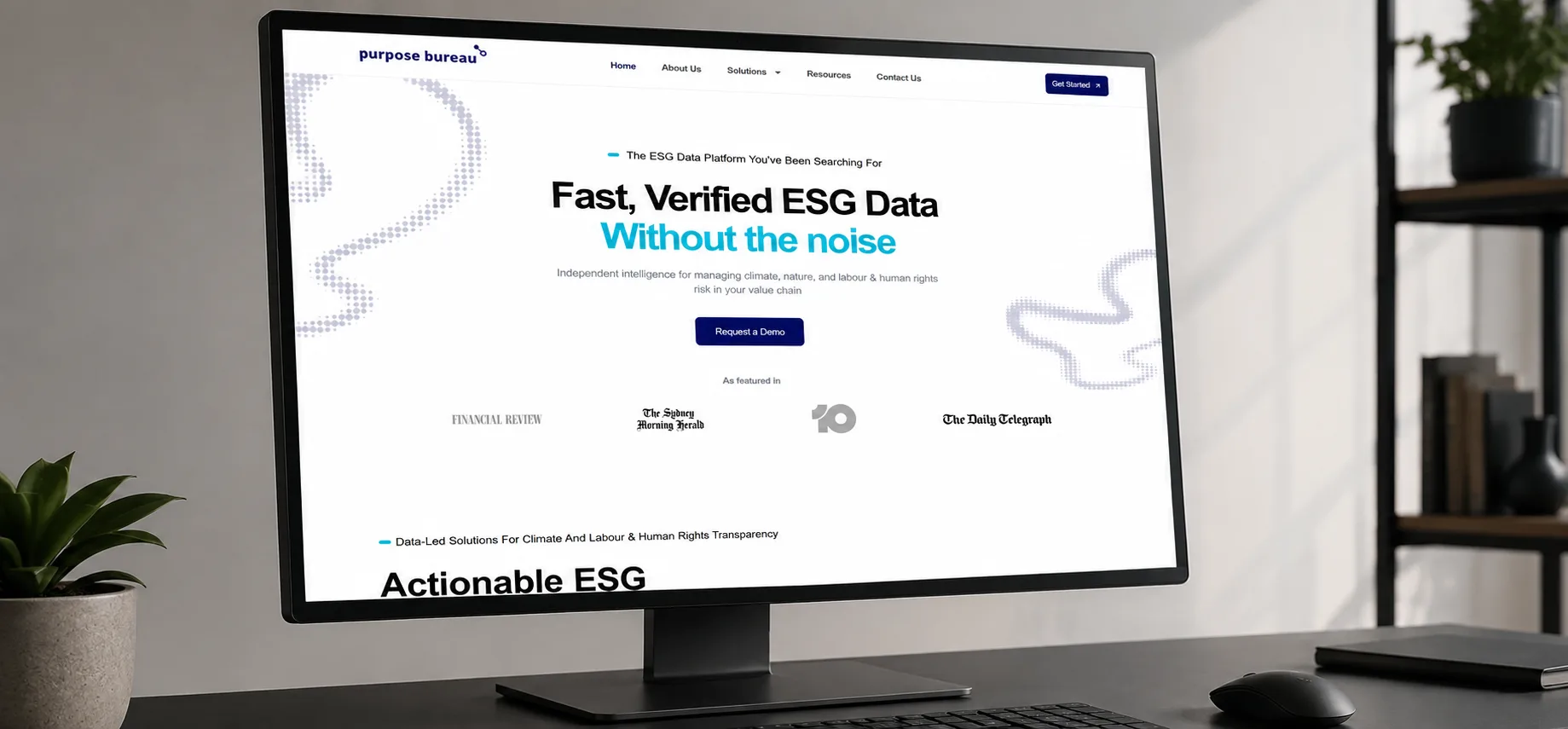
The hard part of this project was never visual. It was explanatory.
Purpose Bureau sells a product whose value sits several layers below the surface. A visitor arriving cold has to understand what the platform does, what regulatory problem it solves, why the underlying data can be trusted, and how to see it working, and they have to understand all four before they will book a demo. That is a lot to carry, and the raw material made it heavier: two independent product lines, dozens of features and use cases, ASRS and Scope 3 and Modern Slavery reporting obligations, a proprietary verification methodology, plus a growing library of research reports and webinars.
There was a second complication underneath the first. The four questions above do not have one audience. A procurement manager and a CFO arrive with different problems, different vocabulary, and different reasons to care. A single generic pitch answers neither of them well.
So the brief was not a visual refresh. It was an information architecture problem with a conversion layer on top: organise all of that into something a corporate buyer can follow in a few screens, and give people at different stages of readiness somewhere useful to go next.
The project ran across one month, with each week’s output feeding the next. Structure, design, and build were planned as one system rather than handed between stages.
We worked through the business, its audiences, and both product lines, audited the existing content, defined the primary conversion actions, and produced the sitemap and page structure. This is also where the separate user journeys for the climate and human rights solutions were mapped.
We wireframed the key pages, designed the homepage, and built out the visual system: typography, components, cards, and calls to action. Most of the design effort went into making dense technical content readable, including how each layout behaves on a phone.
We configured WordPress, assembled the header, footer, and global components, then built the homepage and both product pages. Templates for the team page, the resource library, and report landing pages were built at the same time, along with forms, CTAs, and responsive behaviour.
We migrated and formatted the content, optimised images, tested every form, applied on-page SEO markup, checked the site across desktop, tablet, and mobile, fixed what surfaced, and launched.
Five choices did most of the work.
If your own site has grown past the structure it was originally built on, that is usually a website redesign rather than a rebuild from scratch.
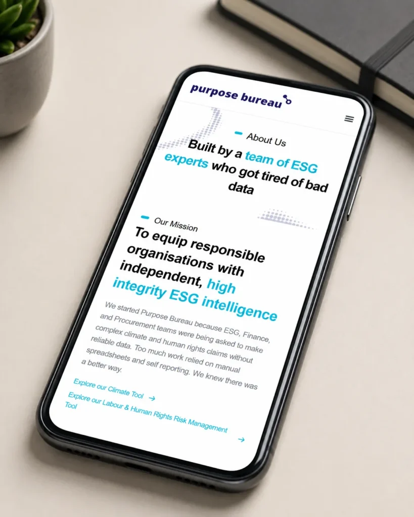
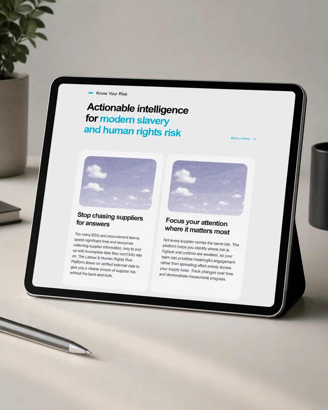
The site runs on a custom WordPress build rather than a purchased theme. The stack is deliberately unremarkable: WordPress, HTML and CSS, a responsive layout, lead capture forms, on-page SEO markup, FAQ structured data on the Climate platform page, and analytics and marketing tags.
The reason for that choice was ownership. A fully custom or headless build was considered and dropped, because the timeline was one month and, more importantly, the marketing team needed to update the team page, publish research, and add report pages without booking developer time. Headless would have made every content change a deployment.
A single-page site was also considered and rejected early. One page cannot properly explain two distinct platforms, cannot address separate search demand for climate reporting and modern slavery compliance, cannot carry the methodology and compliance detail this audience asks for, and gives a growing report library nowhere to live.
The last decision was to run a research hub rather than a conventional company blog. Purpose Bureau’s strongest expert content is industry research, ASRS reporting material, and webinars, not short-form posts. For this audience that format does more for both credibility and lead generation.
The live site carries the full structure the project set out to build.
| Element | How it is handled |
| Product lines | Two dedicated platform pages, Climate and Labour & Human Rights, reachable from a single Solutions menu |
| Problem framing | A four-point problem section directly under the hero, before any feature content |
| Trust signals | Product metrics band, nine client logos, media coverage, awards, full team page, named research partnerships |
| Conversion paths | Request a demo, get started, explore the solution, chat with the team, gated report downloads, newsletter |
| Research library | A resources hub carrying multiple report series and webinars, published by the client on the launch component system |
The clearest signal that the modular approach worked is what the client has published since. New report landing pages and webinar pages have gone live in the original visual system without further design or development work.
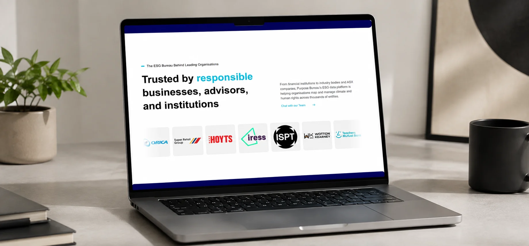
Purpose Bureau had the data, the methodology, and the corporate credibility before this project started. What it needed was a site that made all three legible to a buyer in a few minutes, kept two different products from blurring into one another, and could keep growing without going back to a designer every time.
The site now opens with the buyer’s problem rather than the vendor’s feature list, gives each platform its own page and its own audience, offers a route forward whether someone is ready for a sales conversation or only ready to read a report, and hands the marketing team a component system they can build on themselves. Purpose Bureau needed a site built around its own logic, not fitted into a template. That is what our custom web design and development work is for.
If your product is harder to explain than it is to sell, the fix is usually structure rather than decoration. Talk to us about your project, or see the live Purpose Bureau site to judge the result for yourself.