
Training Up is a registered training organisation, RTO code 40883, operating out of Peakhurst in southern Sydney since 2014. It trains the people who put solar on Australian roofs: grid connect design and install, battery storage systems, remote pilot licences for drones, aeronautical radio operator certificates, and working safely at heights.
The students are working tradespeople. They are not sitting in a computer lab with a fast connection and an afternoon free. They study between jobs, on phones and on site laptops, in the evening after a day on a roof. Many of the courses are long: the Grid Connected PV Systems course alone runs to 503 steps.
That audience changes what a course portal has to do. A slow page is not an inconvenience for someone who has fifteen minutes and one bar of reception. It is the reason the module does not get finished this week. And a portal that hides which step comes next is a portal students abandon halfway.
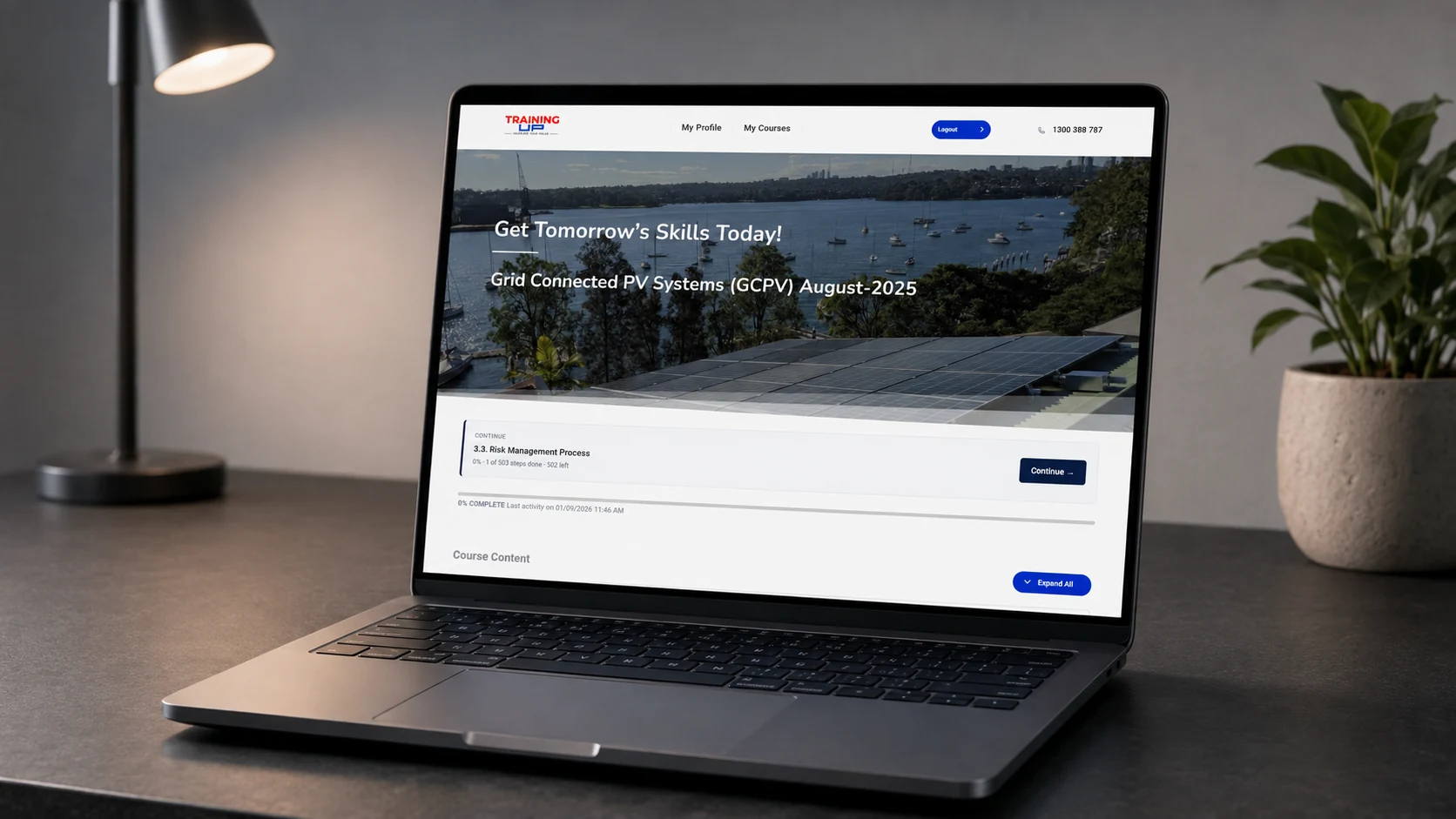
The portal ran on LearnDash with a commercial theme, a design upgrade plugin, an instructor role plugin, a reporting panel and a page builder. Every one of those was doing its job. The problem was that every one of them was loading on every page, whether the page used it or not.
A topic page, the screen a student spends almost all their time on, was pulling 10.9 megabytes over 200 requests. Inside that: 5.8 megabytes of reporting panel assets across 49 files, for a panel students never see. The instructor role interface. The quiz engine, on pages with no quiz. The page builder, on a screen with no builder content. Blocks, media players, a social plugin, an icon font from a theme that was not drawing icons, and a dropdown library nothing was using.
The interface had its own problems. Text ran the full width of a wide screen, which makes a technical paragraph hard to track from one line to the next. The bottom of a step gave the student a bare Previous and Next without saying what was previous or next. The profile listed enrolled courses as grey rows. And on 27 topics the video player had inflated from 930 by 524 pixels to 930 by 859, filling the extra space with black bars and pushing the navigation off the bottom of the screen, so the Next button could not be clicked at all.
That last one is worth pausing on, because it explains the shape of the whole job. Nobody had broken the video. LearnDash ships a stylesheet that forces a 16:9 ratio onto every player on a course page, written for its own wrapper element. Those 27 topics used a plain video shortcode with no wrapper, so the rule landed on the raw player and stretched it. A theme, a plugin and a shortcode each behaving correctly, and a student who cannot reach the Next button.
Measure, then diet, then interface, then content.
We created a temporary student account, enrolled it in all 8 courses, and drove the portal with Playwright: 15 pages across desktop and mobile, 30 loads, plus full runs through quizzes covering 8 of the 9 question types the portal uses. The account and every trace of it were deleted afterwards, and the deletion verified in the database.
We inventoried what each student page actually used, then unloaded the rest, with a whitelist protecting dashboards, builder routes and the instructor and administrator roles.
Reading column, breadcrumbs, step navigation with real names, a rules card before a quiz, continue panels, course cards.
We catalogued 1,108 image occurrences across the two solar courses, classified each one by what it needed, and worked through them.
You cannot open 2,471 topics by hand, and you should not pretend to.
The lesson and topic templates in a LearnDash course are the same template with different content in it. Loading every one of them would produce 2,471 confirmations of the same layout and would find nothing that one topic per course does not find. So the sampling was deliberate: one lesson and one topic from each of the 8 courses, on a 1,440 pixel desktop and a 390 pixel phone, and the time saved went into the part that is genuinely different every time, which is the quizzes.
Quizzes are where a course portal actually breaks. The portal uses nine question types, several of them added by plugins with their own JavaScript, and each type has its own failure mode. We ran full attempts covering eight of the nine. The ninth turned out not to exist on any live quiz in the portal, which is itself a finding rather than a gap in the testing: a question type was installed and configured but never used.
Three things came out of that pass that a page-by-page crawl would have missed.
The first was a font. Every page of the portal was requesting its typeface over plain http from the main marketing domain, and every browser was blocking the request as insecure content. The portal had been falling back to a system font on every screen, on every course, for as long as that stylesheet had been in place. It is the kind of fault that never generates a support ticket, because nothing is broken enough to report.
The second was the quiz links. Every quiz in the portal has two working addresses: the one inside the course structure, and its own permalink. The second is what WordPress hands out by default, what appears in the address bar, and what a trainer would copy if they wanted to send a student straight to an assessment. Of four such links we tested, two opened a blank page with no start button and no error, and one opened a working quiz sitting under a broken progress bar with a JavaScript error underneath it.
The third was not technical at all. One question in a Final Exam offered four answers, two of which were the same sentence twice. There is no correct answer to pick, and no amount of performance work would have surfaced it. It came out of sitting the exam.
We also left the portal exactly as we found it. The student account created for testing was enrolled in all 8 courses, driven through the material, then deleted along with its activity records, its LearnDash user meta and its enrolments, and the deletion was verified in the database rather than assumed.


Everything we added lives in two must-use plugins on the portal: one for the asset diet, one for the student interface. Nothing was edited in the theme, and nothing was added through the page builder.
That decision is about who owns the site afterwards. A theme edit disappears at the next theme update and takes an afternoon to diagnose when it does. A page builder edit is invisible to anyone reading the code. A plugin file is a single object: it can be read, versioned, handed to another developer, and switched off by deleting one file, with the layout untouched.
It also made the risky parts reversible. When one of the asset rules turned out to have a side effect, the fix took minutes rather than a rollback of the site.
| Element | How it is handled |
| Student page weight | 2.7 MB over 76 requests, down from 10.9 MB over 200 |
| Time to DOMContentLoaded | 0.35 seconds, down from 2.5 |
| Reading column | 720 pixels, with breadcrumbs above the heading |
| Step navigation | Named previous and next steps at the bottom of every step |
| Before a quiz | A rules card with attempts and pass conditions |
| Returning student | Continue panels on the course page and the dashboard |
| Video | Native player size restored on 27 topics, no fixed ratio imposed |
| Custom code | Two must-use plugins, each removable by deleting one file |
| Quality assurance | 8 courses, 15 pages across two viewports, 8 of 9 question types exercised |

Training Up already had the accreditation, the trainers and the course material. What it did not have was a portal that respected the conditions its students study in.
An electrician opening a topic on a phone between jobs now downloads a quarter of what they used to, and gets to readable content in a third of a second rather than two and a half. At the bottom of the step they can see what comes next by name. On the 27 topics where the video used to push the Next button off the screen, the course simply continues.
None of that is visible on the marketing site, and none of it shows up in a screenshot of a homepage. It shows up in whether a student who bought a 503-step course finishes it.
If your students study on phones and your portal was built for desktops, the fix is usually not a new theme. It is finding out what each page actually loads and what it never uses. Talk through your website needs with us, or see the Training Up portal and judge the work for yourself.